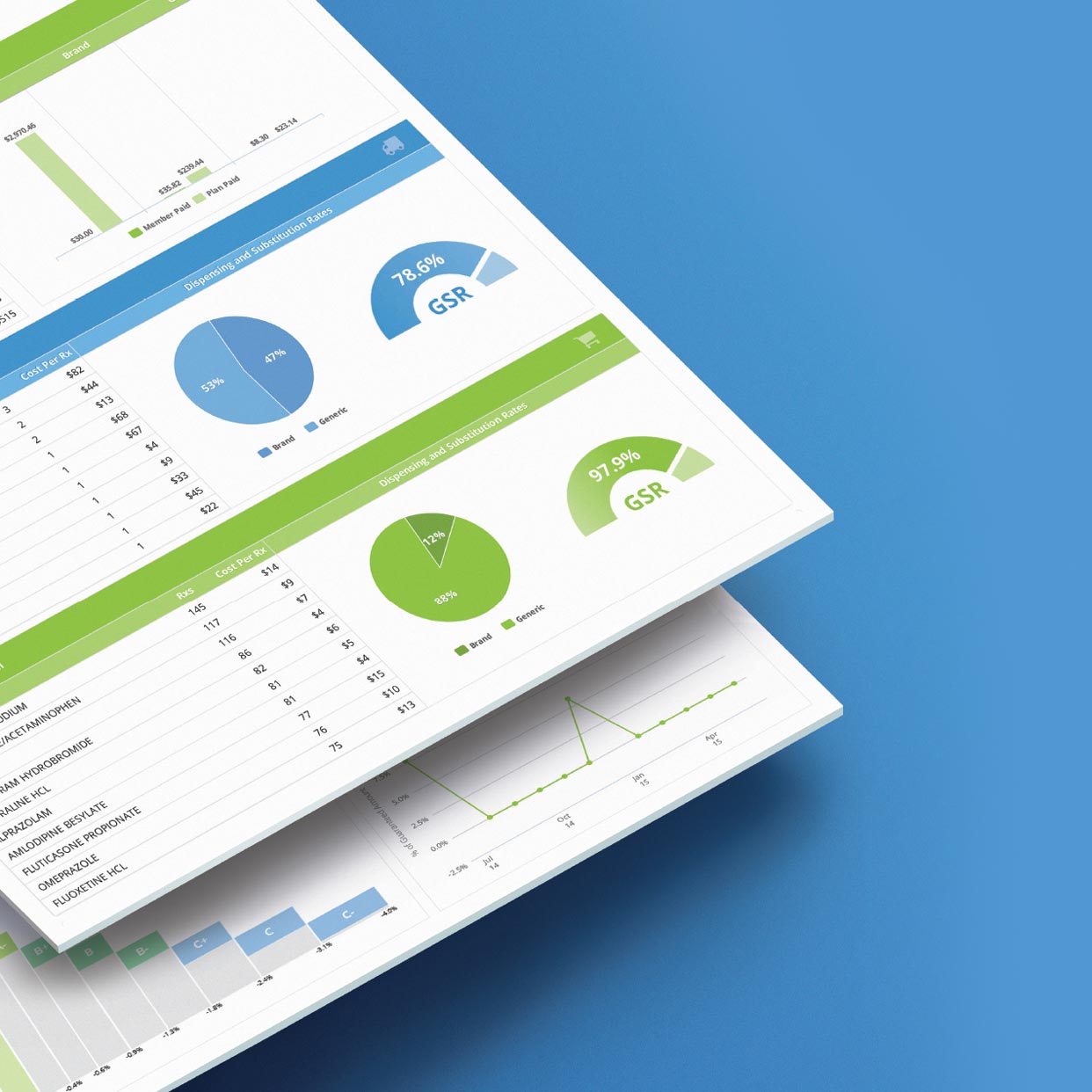
PRINT + ILLUSTRATION
Data Visualization
After working for a decade developing information graphics, way-finding, and visualizations for large architecture and engineering projects I shifted my focus to interactive digital data visualizations for the pharmacy benefit sector.
RxChoice
UI/UX Design | Front End Engineer | Data Visualization
I was responsible for visualizing data as it traveled through the pharmacy benefit ecosphere helping to make the process transparent for employers in order to help them make informed pharmacy benefit cost savings.
Working closely with the CTO and CIO we settled on the frameworks and libraries that would drive the data visualizations. Then, in collaboration with industry experts, each page was prototyped as editable interactive models later to be refactored and incorporated in the app itself, much of which I did myself.
COMP
Art Director | UI Designer | Front End Engineer
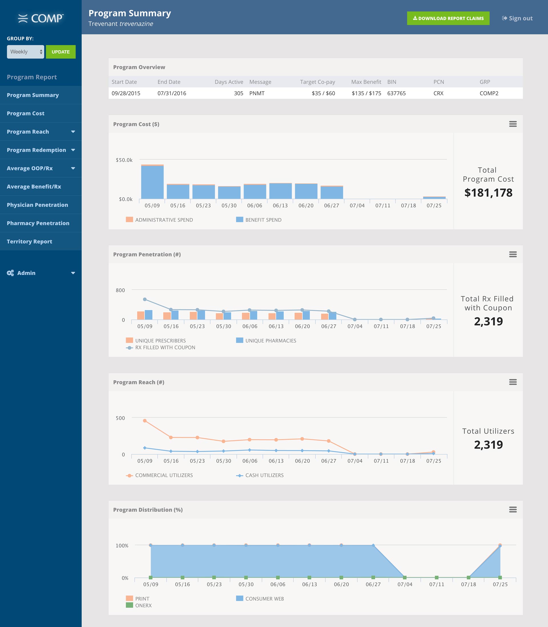
Utilizing RxChoice as a front-end template COMP was an especially exciting project; not just because of the detailed data set that required visualization, but because of the map and print components as well. Additionally, COMP was customizable and the final product included dedicated responsive splash pages and printed coupons in the millions for the pharmaceutical companies who utilized this product.
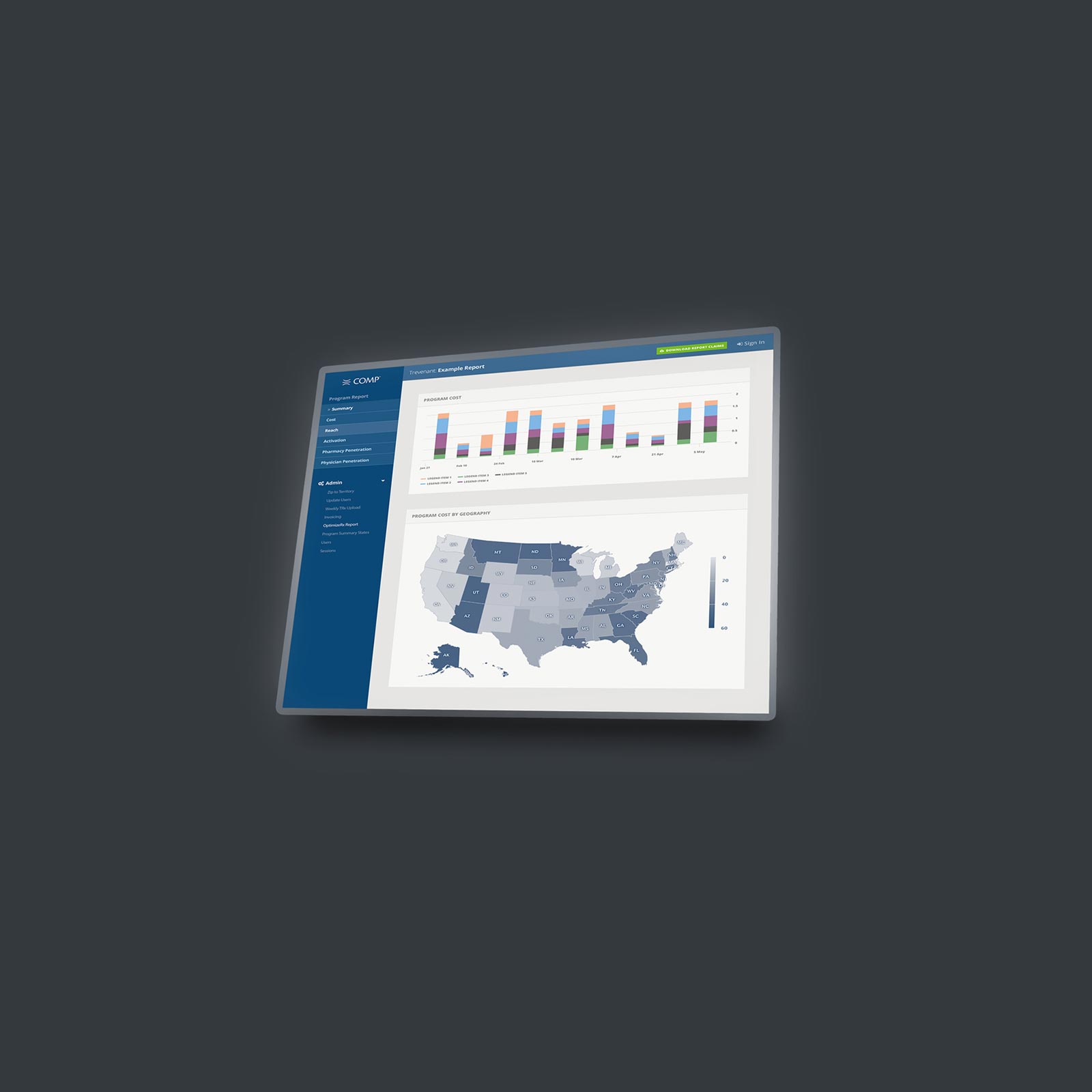
Deeper Insights Through Data Visualizations
One of COMPs challenges was the need to provide a visual language that could be used to extend and articulate a variety of metrics unique to a particular medicine's program.
OneRx
Art Director | UI Designer
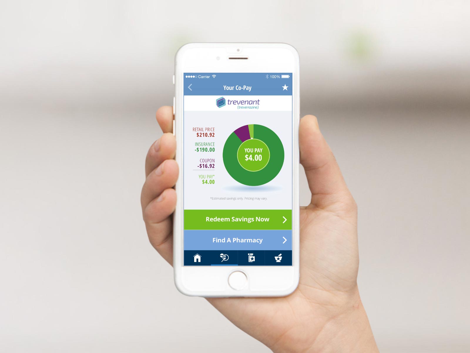
Armed with the knowledge of the previous B2B projects, I ventured into the B2C world with the design of the OneRx user interface. The app relied heavily on design elements such as iconography and maps; additionally, the drug savings chart is an important distillation of the distribution of cost across different channels to help visualize potential savings.
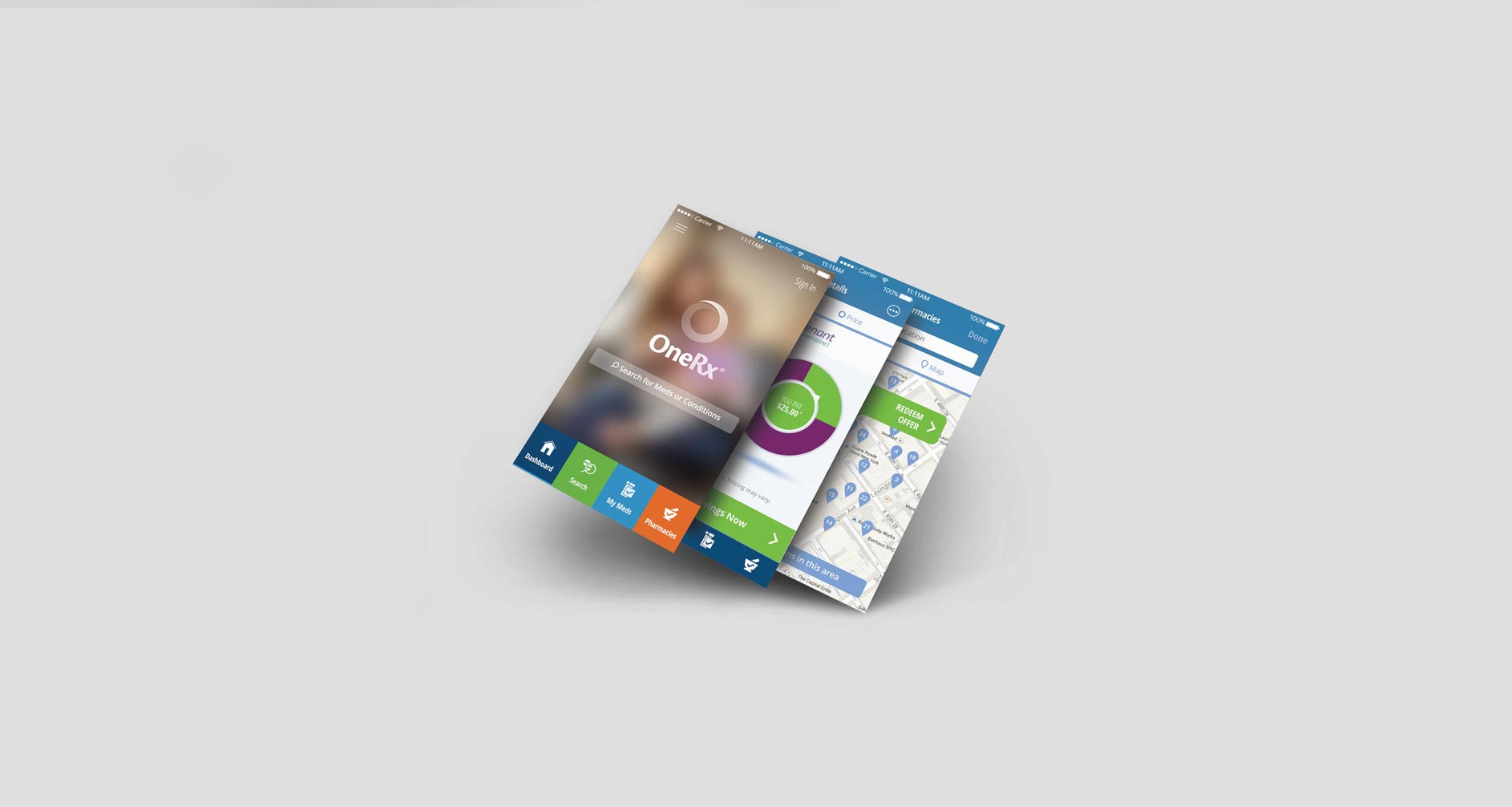
Savings Chart
The challenge of this savings chart was designing a clear, compact view of the cost components of a single medication. It was one of the most successful features in the app during UX testing.
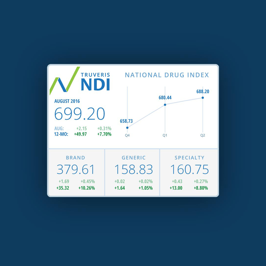
National Drug Index
Art Director | Designer | Front End Engineer
This was actually the second stock widget I designed in my years working as a front-end developer. In this case the NDI was a responsive widget that had a unique dataset.
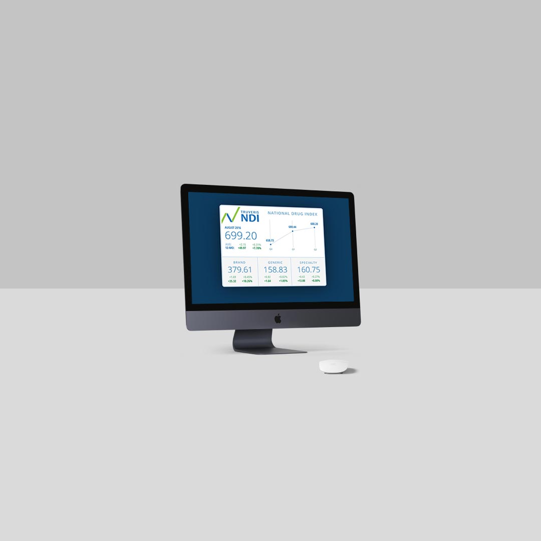
Unobtrusive & Clean
Since the widget would appear on a number of sites, in a number of contexts, it was designed to be maximally flexible, easy to read, and minimal in appearance.
